DIRECTV Kids
Role: UI & Interaction Design
January 2014 - August 2014
Launched on iTunes May 2015
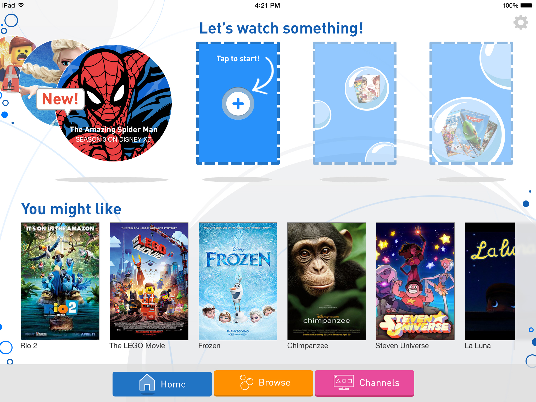
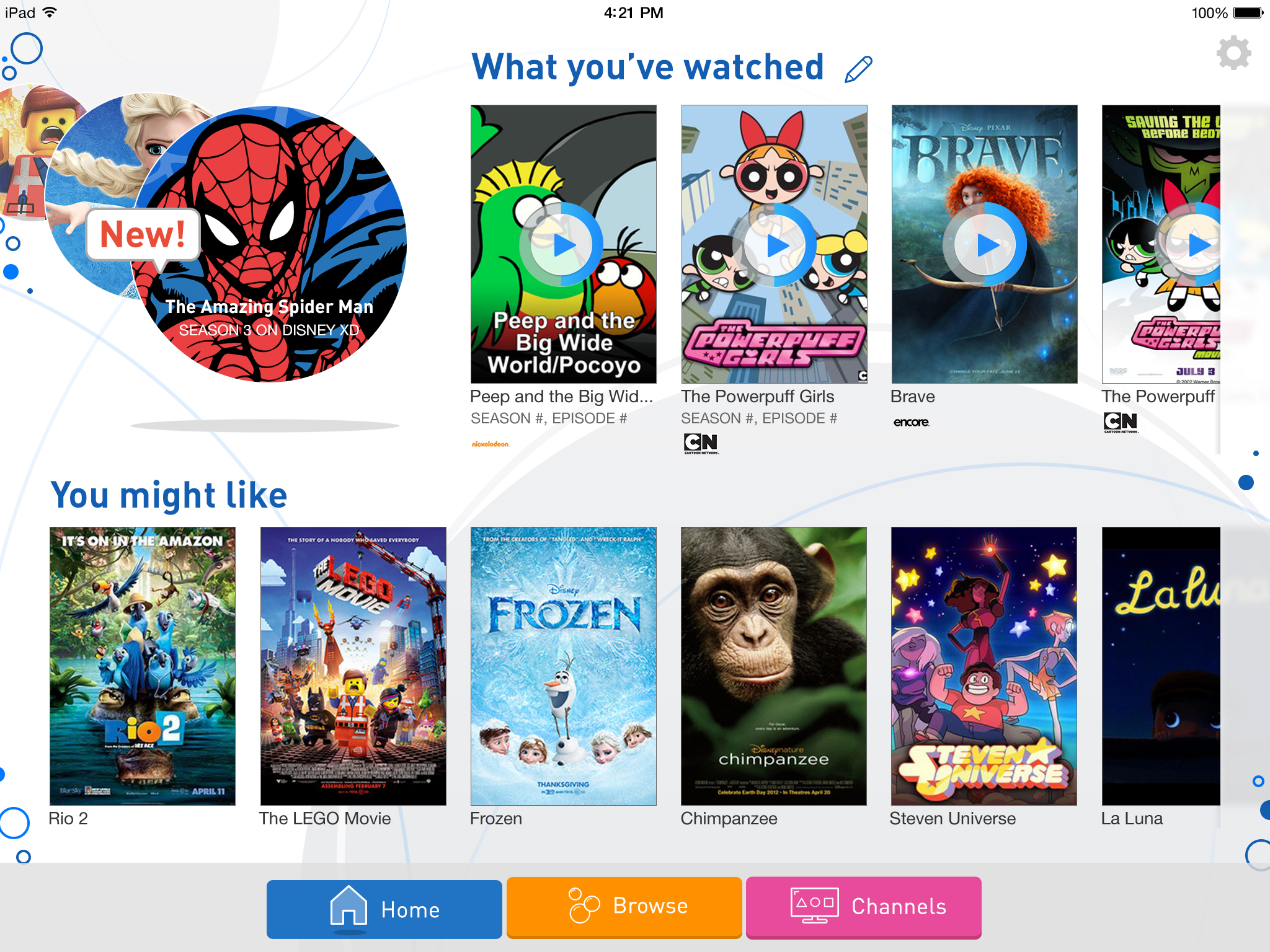
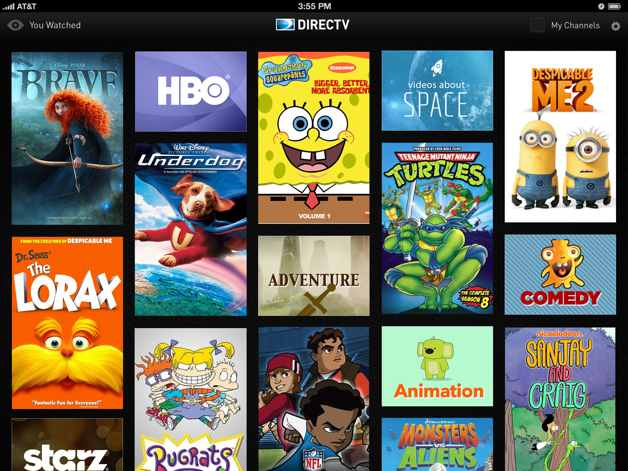
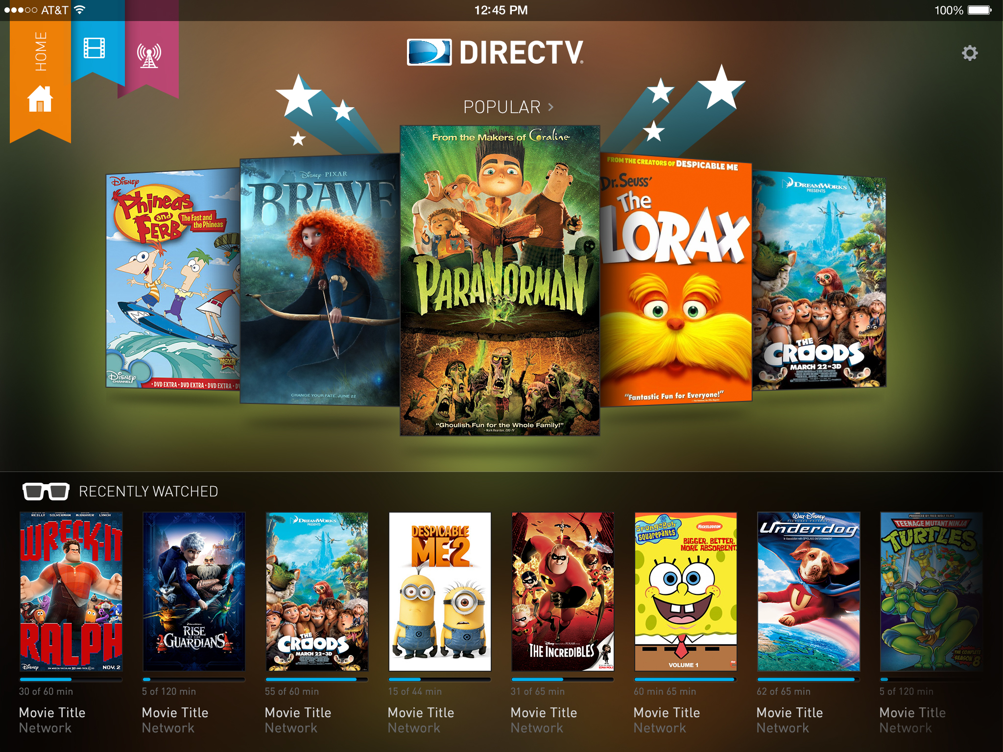
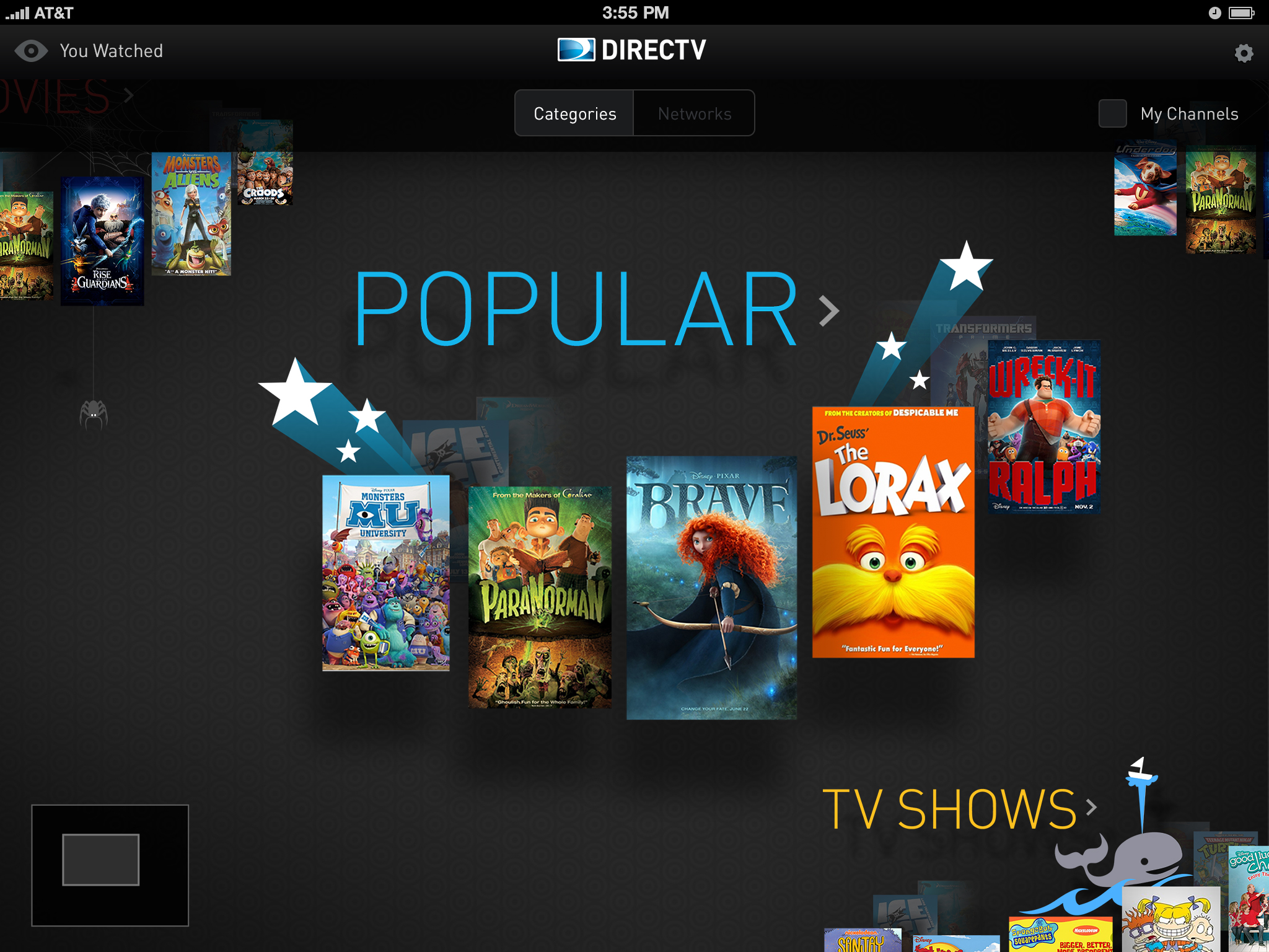
We launched a kids app, aimed at parents looking for a quick and effective way to keep age-inappropriate content out of the hands of their children.
Not only was this a first for DIRECTV, but internally, this was the first project using Agile, as the company was looking to transition out of Waterfall. We worked in two week sprints. One pair of UI & UX Designers in Los Angeles, another in New York. Our developers, product managers, product owners, and QA teams were all in-house in Los Angeles.
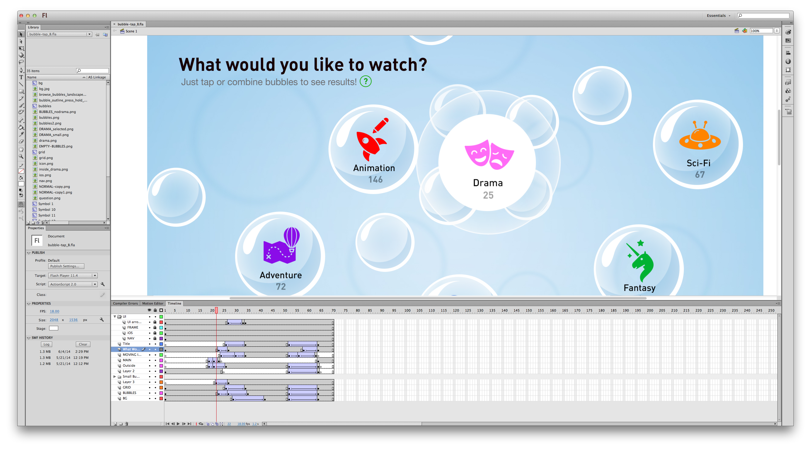
"The Drawing Board"
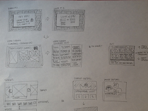
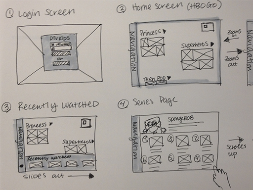
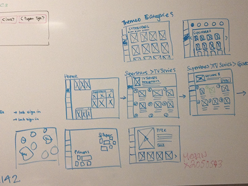
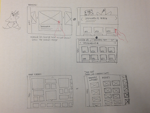
Early Explorations
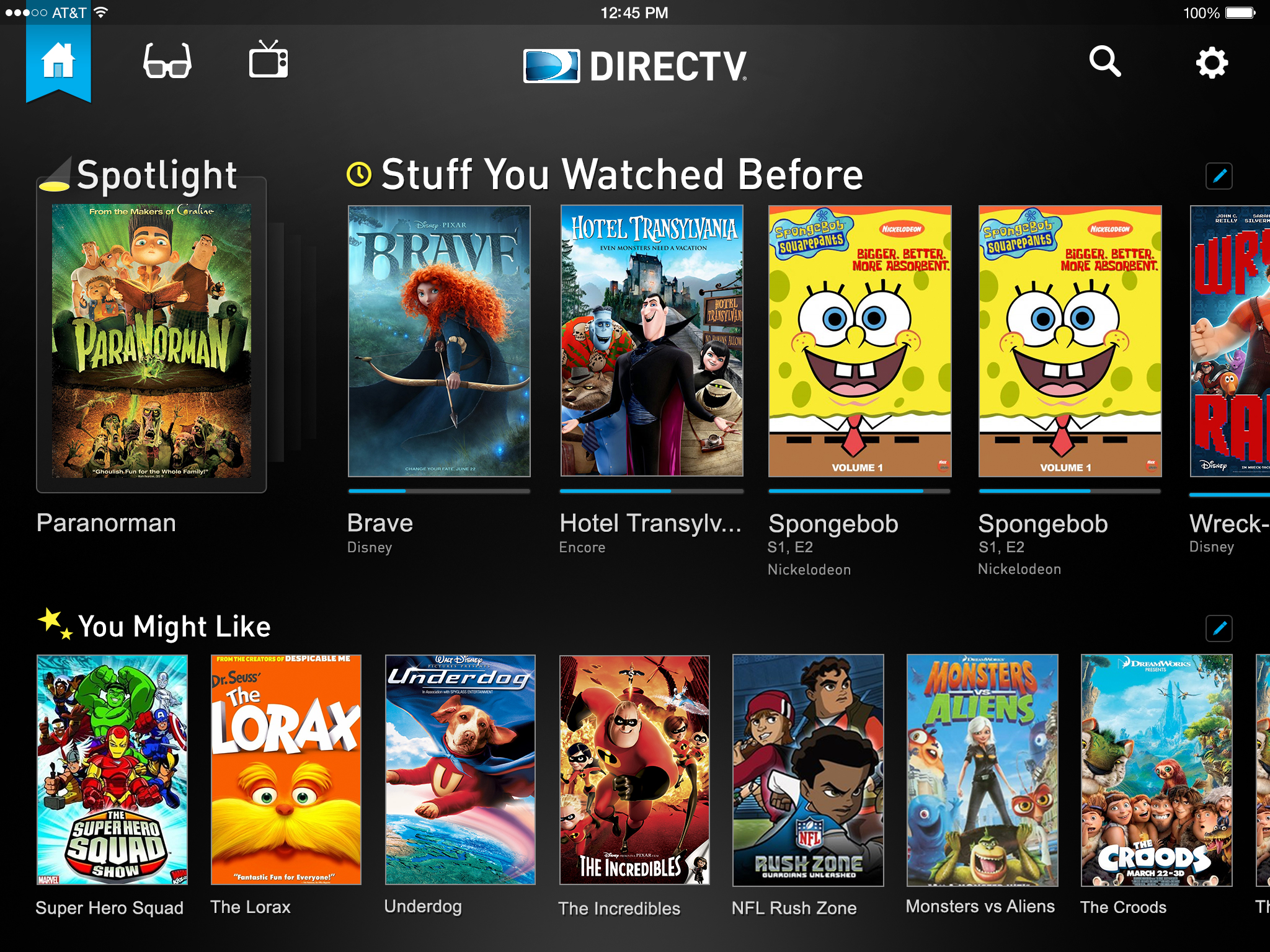
Designing a Kids app for DIRECTV presented a challenge in the very beginning because we knew that dark backgrounds and the younger demographic don't mix well. The DIRECTV brand is primarily dark, for its entertainment and immersive identity. Is it possible to make a dark childrens app? How far away from the DIRECTV brand can we go? Can we utilize the poster images to guide the user? Who is our user? The children, or the parents of the children? Or Both?
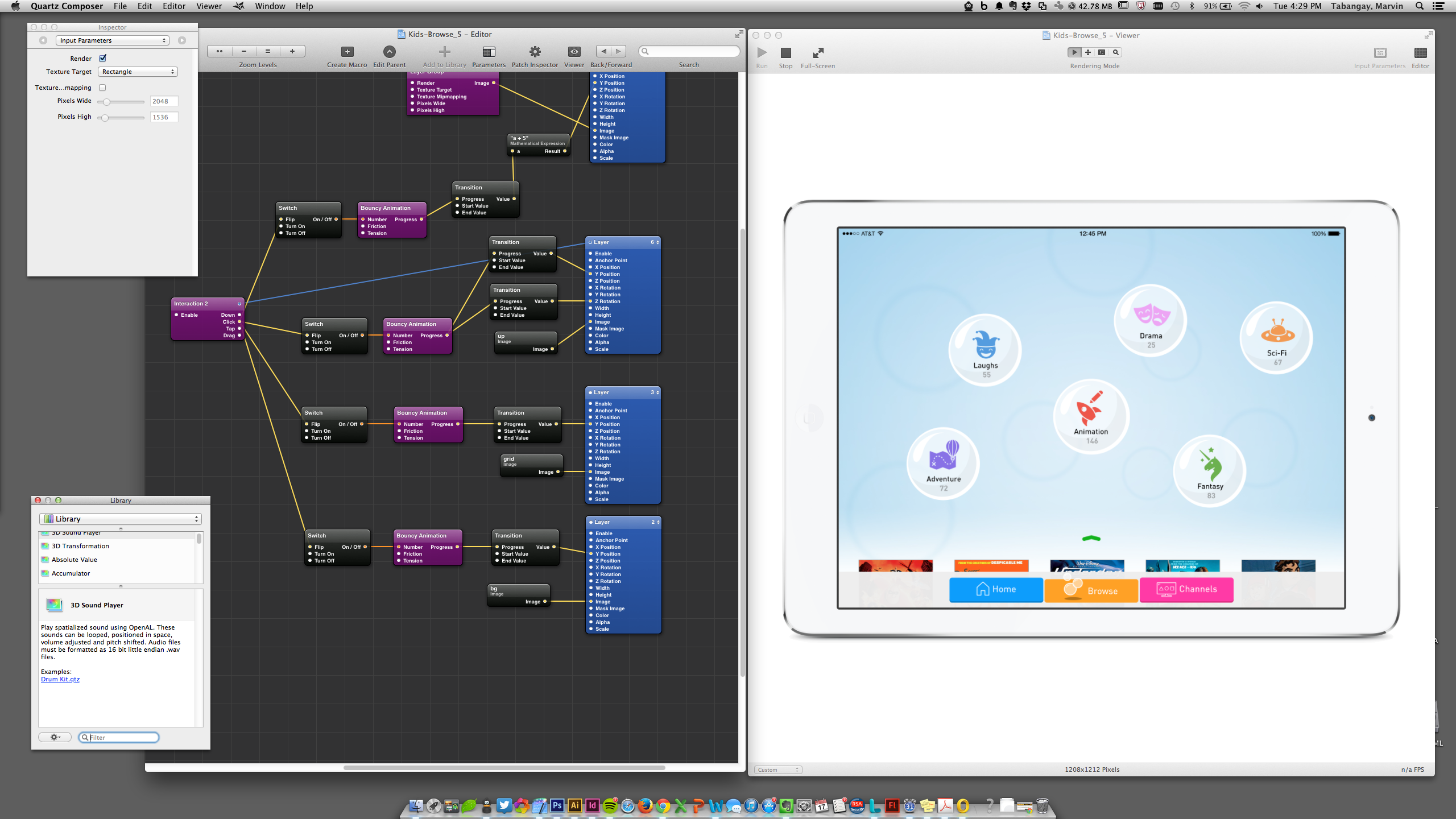
Interaction Prototypes
We used whatever it took to get the idea across. We used Quartz Composer, Adobe Flash, and HTML/CSS test sites. We worked closely with our developers, using daily stand-ups, and working sessions to get immediate feedback on our ideas and how far we could push some of the technology.
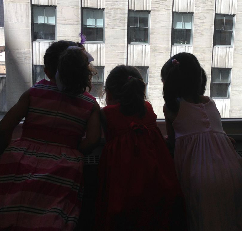
User Testing
At the time, we didn't have a dedicated user research team, so we took advantage of a Take Your Kids to Work Day in our New York offices. With permission of their parents, we showed some early explorations, interactions, and received feedback for some of our initial designs. We had 18 participants, ranging from 3 to13 years old.
Findings:
- They picked content based on the characters that were familiar, regardless of overall app design.
- Older participants were less inclined to use an app design they perceived to be too baby-like.
"PBS is a baby party" - Mateo, age 7 - They preferred lighter color and white UI treatments.
- Across the board, dark backgrounds were too "anti-kid."
- Gestures and interactions on the bubble prototype were natural, easy to learn and use.
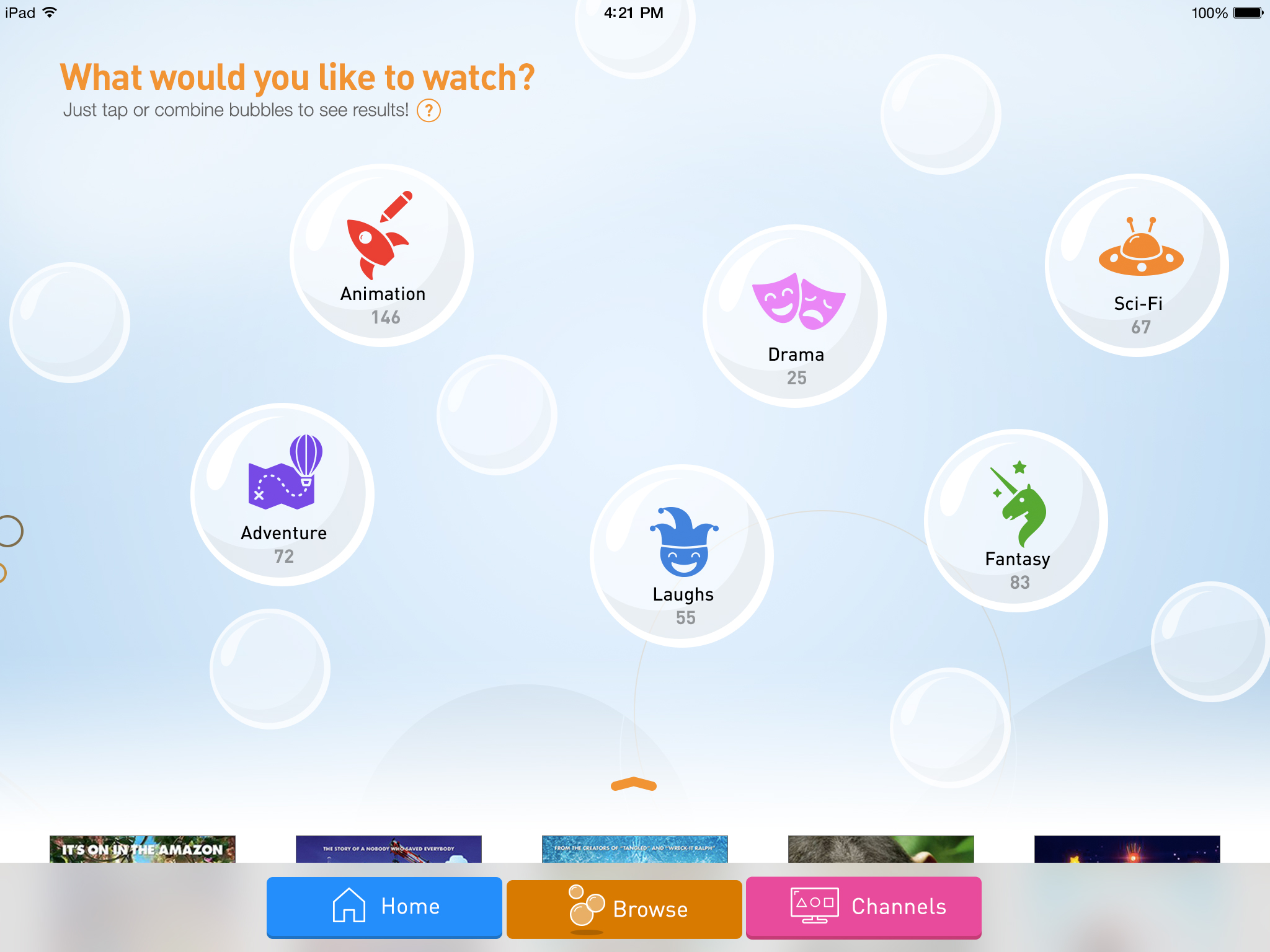
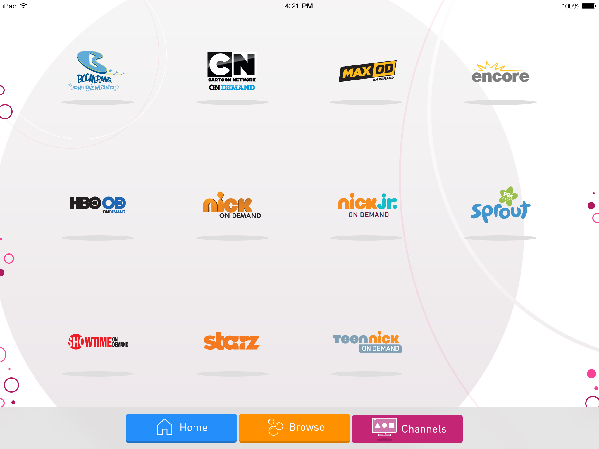
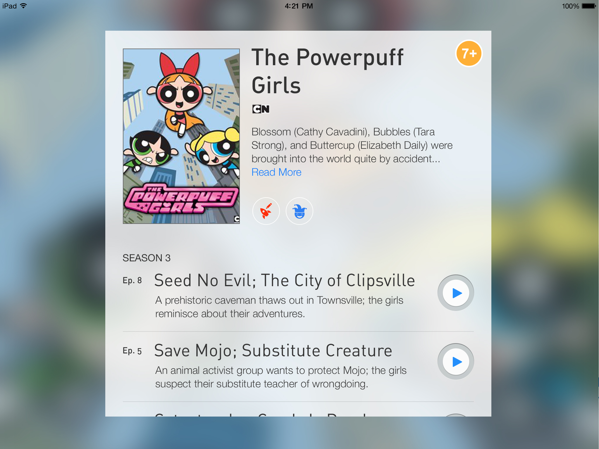
Version 1.0, Launched May 2015